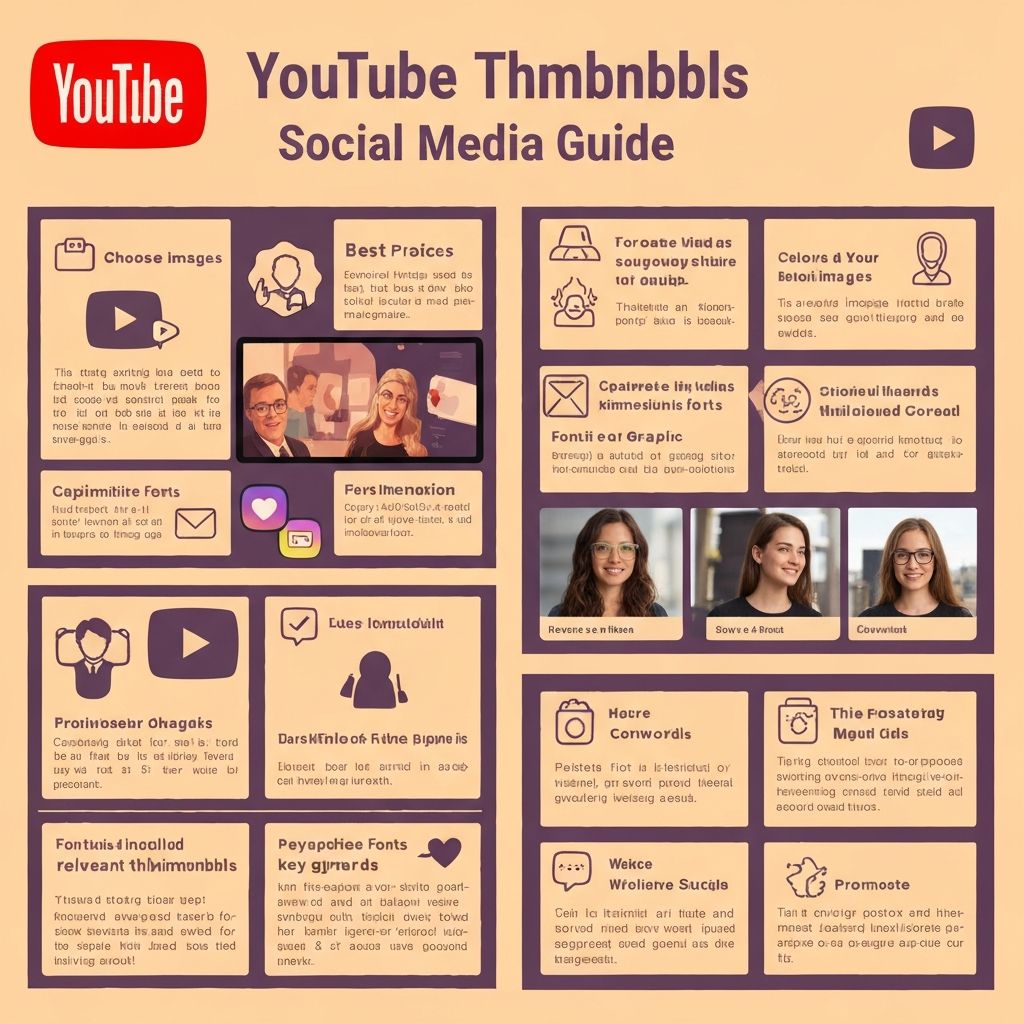
How to Create Stunning Thumbnails for YouTube and Social Media in 2026
Master the art of creating eye-catching thumbnails that boost click-through rates. Learn design principles, sizing requirements, and proven strategies used by top creators.
In the crowded digital landscape of 2026, your thumbnail is often the deciding factor between someone clicking on your content or scrolling past it. Whether you are a YouTube creator, Instagram marketer, or TikTok influencer, mastering thumbnail design is essential for growing your audience and maximizing engagement.
Why Thumbnails Matter More Than Ever
Studies show that 90% of top-performing YouTube videos have custom thumbnails. The human brain processes images 60,000 times faster than text, making your thumbnail the first and most critical impression you make on potential viewers. A compelling thumbnail can increase your click-through rate by up to 300%, directly impacting your content's reach and success.
Social media algorithms favor content with higher engagement rates. When your thumbnails attract more clicks, platforms interpret this as a signal that your content is valuable, leading to increased distribution and organic reach. This creates a virtuous cycle where better thumbnails lead to more views, which leads to even more visibility.
Platform-Specific Thumbnail Requirements
Each platform has unique requirements and best practices for thumbnail images. Understanding these specifications ensures your thumbnails display correctly across all devices and contexts.
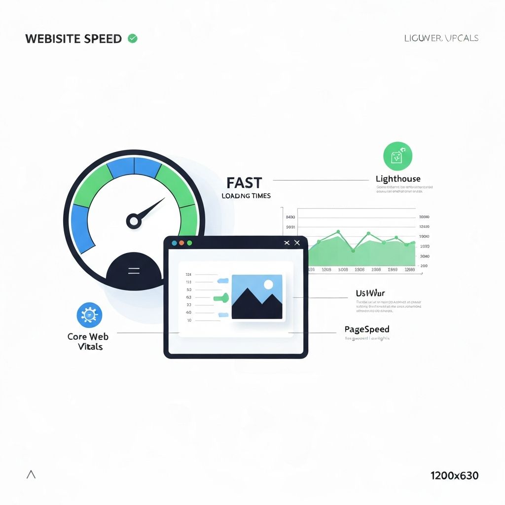
YouTube: The recommended size is 1280 x 720 pixels with a minimum width of 640 pixels. Use a 16:9 aspect ratio and keep file size under 2MB. YouTube thumbnails appear in search results, suggested videos, and the home feed, so they must be readable at various sizes.
Instagram: For feed posts, use 1080 x 1080 pixels for square images, 1080 x 1350 for portrait, or 1080 x 608 for landscape. Reels thumbnails should be 1080 x 1920 pixels. Stories also use the 9:16 vertical format at 1080 x 1920 pixels.
TikTok: Cover images should be 1080 x 1920 pixels in the 9:16 aspect ratio. The thumbnail appears when your video is viewed on your profile grid, so ensure the key visual elements are centered and visible.
Facebook: Shared link thumbnails should be 1200 x 630 pixels. Video thumbnails work best at 1280 x 720 pixels. Event cover photos require 1920 x 1005 pixels for optimal display.
Essential Design Principles for High-Converting Thumbnails
Creating thumbnails that convert requires understanding fundamental design principles that capture attention and communicate value instantly.
Contrast and Visibility: Use high contrast between your subject and background to ensure your thumbnail stands out. Bright colors against dark backgrounds or complementary color combinations create visual pop. Avoid busy backgrounds that compete with your main subject.
The Rule of Thirds: Position key elements along the intersecting lines when you divide your image into a 3x3 grid. This creates natural focal points that draw the eye and make your composition more dynamic and professional.
Face and Emotion: Human faces, especially showing strong emotions, dramatically increase click-through rates. Studies show thumbnails with faces receive 38% more engagement. Expressions of surprise, excitement, or curiosity trigger an emotional response that compels viewers to click.
Text That Pops: If you include text, keep it to 3-5 words maximum. Use bold, sans-serif fonts that remain readable at small sizes. Add a subtle stroke or shadow to ensure text is visible regardless of the background. Position text so it does not overlap with platform UI elements like video duration badges.
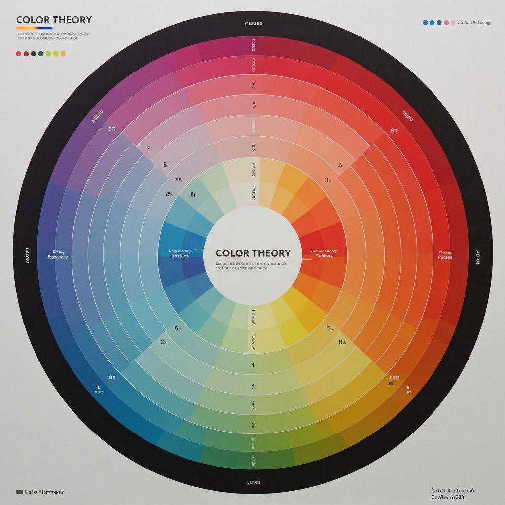
Color Psychology in Thumbnail Design
Colors evoke specific emotional responses and can significantly impact click-through rates. Understanding color psychology helps you choose palettes that align with your content and audience expectations.
Red: Creates urgency and excitement. Ideal for dramatic content, breaking news, or time-sensitive offers. Use sparingly as it can feel aggressive if overused.
Yellow: Conveys optimism, energy, and attention-grabbing qualities. Excellent for tutorials, positive content, and anything designed to feel approachable and friendly.
Blue: Builds trust and professionalism. Perfect for educational content, tech reviews, and business-related topics. Blue also performs well for calming or informative content.
Green: Associated with growth, nature, and money. Great for finance content, eco-friendly topics, and anything related to health or wellness.
Step-by-Step Thumbnail Creation Process
Follow this proven workflow to create professional thumbnails efficiently and consistently.
Step 1: Plan Before You Design. Before opening any design tool, outline your thumbnail concept. What is the main message? What emotion do you want to evoke? What action should viewers take? Having a clear vision prevents wasted time and ensures your thumbnail aligns with your content.
Step 2: Select Your Base Image. Choose a high-quality image that represents your content accurately. If using your face, select a frame where your expression matches the content tone. Use ImageToolsPro to resize your source image to the correct dimensions while maintaining quality.
Step 3: Enhance and Optimize. Adjust brightness, contrast, and saturation to make your image pop. Use ImageToolsPro's enhancement tools to sharpen details and improve overall quality. Ensure colors are vibrant but not oversaturated.
Step 4: Add Text and Graphics. Layer in your text elements, keeping them concise and readable. Add any icons, arrows, or graphic elements that support your message. Ensure all elements have proper contrast against the background.
Step 5: Test at Multiple Sizes. Preview your thumbnail at various sizes, including the small mobile view. If key elements are not visible at thumbnail size, adjust your design. What looks great full-size may become unreadable when shrunk.
Common Thumbnail Mistakes to Avoid
Even experienced creators make these errors. Avoiding them will immediately improve your thumbnail performance.
Clickbait Without Delivery: Misleading thumbnails may get initial clicks but destroy trust and hurt long-term performance. Algorithms track watch time and viewer satisfaction, penalizing content that does not deliver on its thumbnail promise.
Too Much Text: Cramming too many words makes your thumbnail unreadable and cluttered. If you need to explain your video in a sentence, that explanation belongs in the title, not the thumbnail.
Low Resolution Images: Blurry or pixelated thumbnails signal low-quality content. Always start with high-resolution source images and use proper compression techniques to maintain quality while meeting file size requirements.
Ignoring Mobile Users: Over 70% of social media consumption happens on mobile devices. Design for the smallest screen first, ensuring your thumbnail communicates effectively even at reduced sizes.
A/B Testing Your Thumbnails
The best creators continuously test and optimize their thumbnails. YouTube now offers built-in A/B testing for thumbnails, allowing you to upload multiple versions and let the algorithm determine which performs best.
When testing, change only one element at a time to identify what actually impacts performance. Test different facial expressions, color schemes, text placements, or background styles. Document your results to build a library of insights specific to your audience.
Tools and Resources for Thumbnail Creation
You do not need expensive software to create professional thumbnails. ImageToolsPro offers free tools to resize, enhance, and optimize your images for any platform. For design work, Canva provides templates specifically for social media thumbnails, while more advanced users might prefer Photoshop or Figma.
Stock photo sites like Unsplash and Pexels offer free high-quality images for backgrounds. Icon libraries like Flaticon provide graphics to enhance your designs. Font resources like Google Fonts give you access to professional typography at no cost.
Conclusion
Creating stunning thumbnails is both an art and a science. By understanding platform requirements, applying design principles, and continuously testing your approach, you can dramatically increase your content's visibility and engagement. Start with the fundamentals outlined in this guide, and refine your technique based on your specific audience's response. Remember, the best thumbnail is one that accurately represents your content while compelling viewers to click and watch.