Color Theory for Image Editing: A Complete Guide for Beginners
Master the fundamentals of color theory and learn how to apply these principles to create visually stunning images with better color harmony and emotional impact.
Color is one of the most powerful tools in image editing. Understanding color theory transforms how you approach editing, enabling you to create images that evoke specific emotions, guide viewer attention, and achieve professional-quality results consistently.
The Color Wheel: Foundation of Color Theory
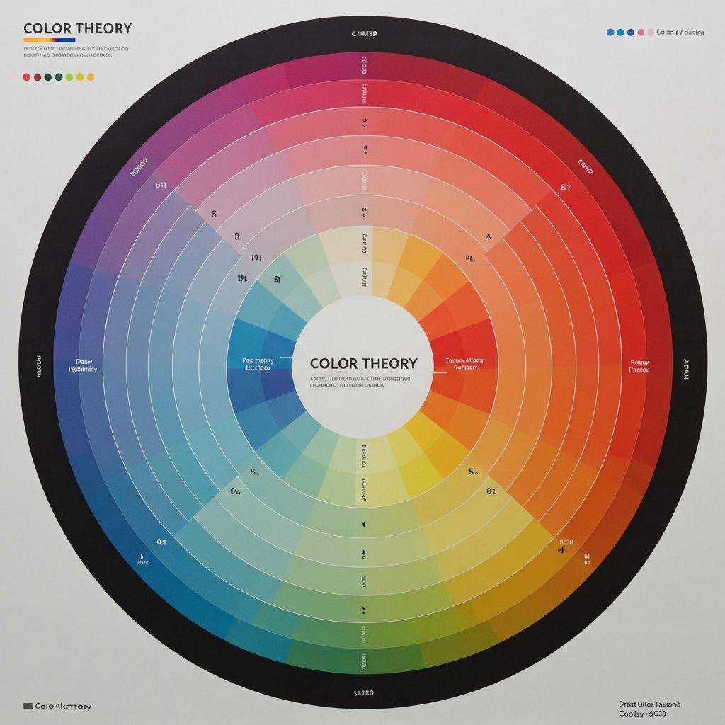
The color wheel is the fundamental tool for understanding color relationships. Developed by Isaac Newton in 1666, it organizes colors in a circle showing their relationships. The wheel contains primary colors (red, yellow, blue), secondary colors (created by mixing primaries: orange, green, purple), and tertiary colors (mixing primary and secondary colors).
Understanding the color wheel helps you make informed decisions about color combinations in your images. Whether you're adjusting white balance, enhancing specific hues, or creating a cohesive color palette, the wheel provides a roadmap for effective color choices.
Color Harmony: Creating Pleasing Combinations
Color harmony refers to arrangements of colors that are visually appealing. Several proven harmony formulas help create balanced, professional-looking images:
Complementary Colors: Colors opposite each other on the wheel (like blue and orange) create high contrast and visual impact. Use sparingly for emphasis—a sunset sky with warm oranges and cool blue shadows is a classic example.
Analogous Colors: Colors adjacent on the wheel (like blue, blue-green, and green) create serene, comfortable designs. Nature photography often features analogous color schemes that feel naturally harmonious.
Triadic Colors: Three colors equally spaced on the wheel create vibrant, balanced compositions. This scheme is popular in graphic design and can make images feel dynamic and energetic.
Split-Complementary: A color plus the two colors adjacent to its complement. This provides high contrast like complementary schemes but with more nuance and sophistication.
Understanding Color Properties
Every color has three properties that you can adjust in image editing: hue, saturation, and luminance (HSL). Mastering these controls gives you precise command over your images' appearance.
Hue is the color itself—where it falls on the color wheel. Shifting hue changes blue to purple or green, allowing you to completely transform an image's color palette or make subtle corrections.
Saturation is color intensity. High saturation creates vivid, punchy colors; low saturation creates muted, subtle tones. Desaturating completely creates grayscale. Most images benefit from selective saturation adjustments rather than global changes.
Luminance is color brightness. Adjusting luminance can make colors pop or recede without changing their hue or saturation. Brightening skies or darkening greens are common luminance adjustments.
Color Psychology in Images
Colors evoke emotional responses, and understanding this psychology helps you create images that communicate effectively. Consider how color choices support your message:
Warm colors (red, orange, yellow) feel energetic, passionate, and attention-grabbing. They advance visually, making objects appear closer. Use warm tones for images conveying excitement, urgency, or warmth.
Cool colors (blue, green, purple) feel calm, professional, and trustworthy. They recede visually, creating depth. Corporate imagery often favors cool tones for their association with reliability and competence.
Neutral colors (black, white, gray, brown) provide balance and sophistication. They allow accent colors to stand out and create timeless, elegant compositions.
Practical Color Editing Techniques
Apply color theory through specific editing techniques. White balance correction ensures colors appear natural under different lighting conditions. Shoot in RAW format when possible for maximum flexibility in white balance adjustments.
Color grading adds creative color treatments that establish mood and style. Popular looks include orange-teal (complementary colors popular in cinema), warm vintage tones (lifted blacks with warm highlights), and clean bright styles (neutral whites with vibrant colors).
Selective color adjustments target specific hues without affecting others. Make grass greener without changing skin tones, or enhance a sunset's oranges while keeping shadows blue. This precision control separates amateur edits from professional results.
Common Color Mistakes to Avoid
Over-saturation is the most common color mistake. While punchy colors can be appealing, pushing saturation too far creates unnatural, garish results. Always check skin tones—they reveal over-saturation immediately.
Ignoring color temperature consistency causes jarring images. Mixed lighting (daylight and tungsten, for example) creates competing color casts that feel wrong even to untrained eyes.
Using too many colors creates visual chaos. Limit your palette to 2-4 main colors for most images. Let one color dominate while others play supporting roles.
Building Your Color Intuition
Color theory knowledge becomes powerful when combined with practice. Study images you admire and analyze their color choices. What makes them work? Which harmony formula do they use? How do colors support the subject?
Experiment with different color grades on the same image to see how dramatically color affects mood. Save presets of color treatments you like for quick application to future images. Over time, you'll develop intuitive understanding that guides your editing decisions automatically.